If you search for Nano Banana 2 tips today, most results give you prompt lists. That is useful for inspiration, but it does not solve the real problem. Most people do not need fifty random prompts. They need a repeatable way to get cleaner text, more stable characters, better product shots, and fewer broken generations.
That is what this guide is for.
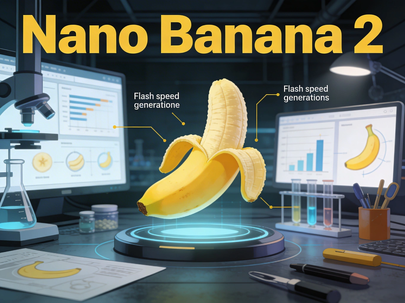
Nano Banana 2, released by Google as Gemini 3.1 Flash Image on February 26, 2026, is the fast image model that brings many Pro-style capabilities into a Flash workflow. It pushes faster iteration, stronger instruction following, better text rendering, broader world knowledge, and production-ready output controls. As of March 23, 2026, Google is also rolling it out broadly across Gemini, Search, Flow, Ads, AI Studio, and Vertex AI.
The useful question is not whether Nano Banana 2 is good in the abstract. The useful question is this:
What kind of prompt and workflow gives you reliable results with Nano Banana 2 instead of pretty-but-wrong images?
This guide answers that question with:
A clear prompt structure you can reuse
The right workflow for text, characters, and product visuals
Resolution and aspect-ratio choices that actually matter
Common failure modes and how to recover quickly
A practical production path if you want to use Nano Banana 2 inside a broader AI creation stack
Nano Banana 2 comes down to a simple promise: Pro-like quality at Flash speed. In practice, that means the model is strongest when you want fast iteration on image tasks that still need decent control.
It is especially strong for:
Marketing mockups with short, legible text
Story sequences with recurring characters
Product-style compositions with lighting and material detail
Infographics, posters, and diagram-like visuals
Image editing where you want to preserve the original style and perspective
It is weaker when you ask it to do too many things at once, especially when your request mixes:
Dense text blocks
Too many subjects
Too many object relationships
Unclear visual hierarchy
Multiple style instructions that conflict with each other
One detail matters if you build workflows instead of one-off experiments:
Source
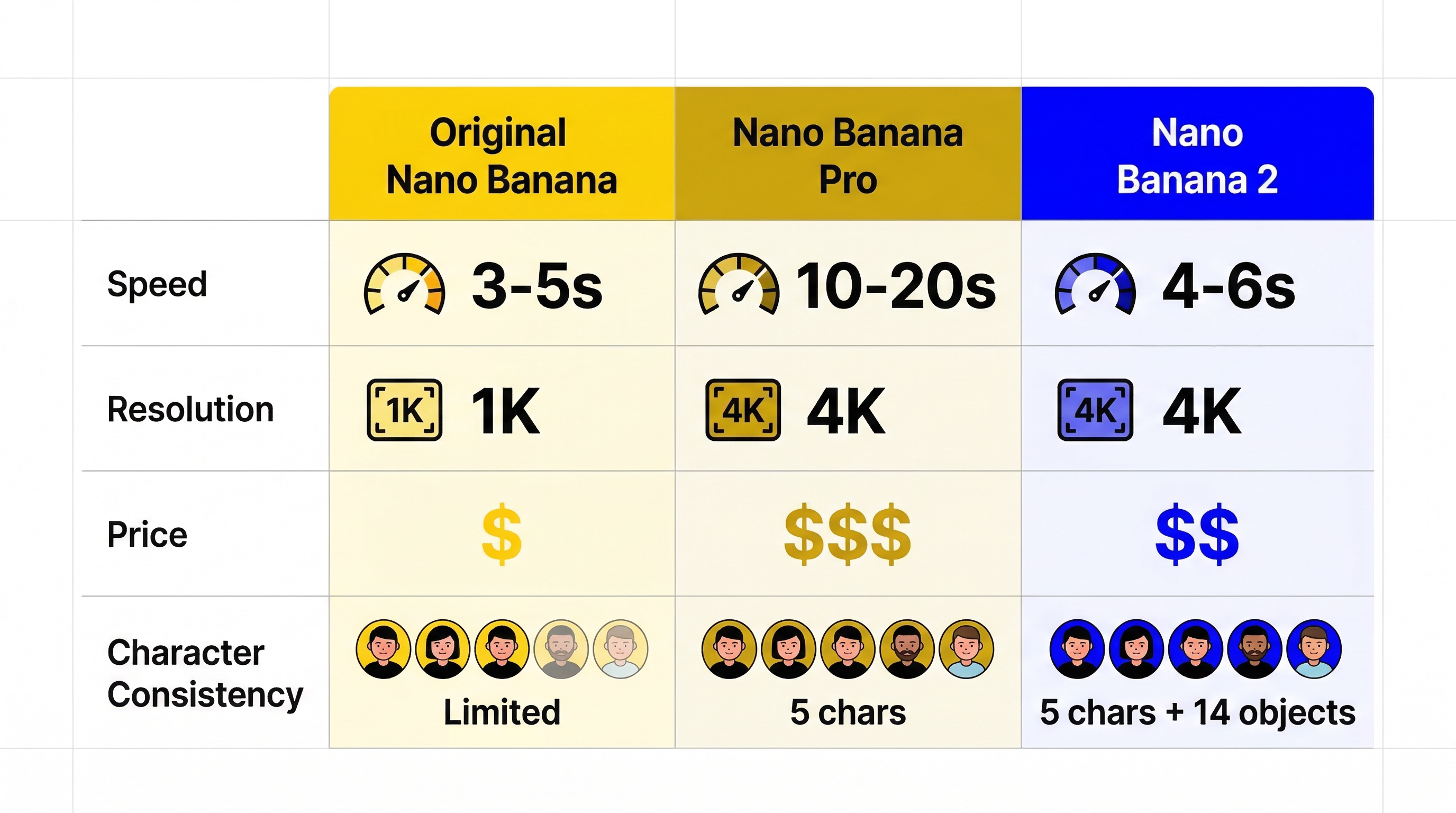
Stated consistency limit
Google consumer launch post
Up to 5 characters and 14 objects
Current Gemini API image docs for gemini-3.1-flash-image-preview
Up to 4 characters and 10 objects
That difference is important. The safer interpretation is operational rather than promotional: if you need repeatable output, design your prompts around the lower API-facing limit. In other words, do not build a production workflow that assumes perfect consistency across five characters and a dozen-plus objects just because a launch article showcased it.
Nano Banana 2 is best when your prompt stays focused and the scene has a clear primary subject.
Most prompt guides treat every use case as plain text-to-image. That is a mistake. Nano Banana 2 behaves differently depending on whether you are generating from scratch, editing an image, grounding to real-world context, or pushing for higher reasoning.
Use this table first. It will save you more time than another batch of prompt ideas.
Goal
Best workflow
Why it works
Create a new scene quickly
Text-to-image
Fastest path when composition is simple and you do not need to preserve an existing image
Fix only part of an image
Image editing with reference image
Better control over style, lighting, and perspective retention
Render real places, real objects, or current context
Grounded generation
Nano Banana 2 can use Google web and image search for better real-world reference alignment
Improve adherence on a complex brief
Higher thinking level or staged prompting
Better for layered constraints, dense compositions, and instructions that must be followed in order
This is the right choice for posters, ads, concept art, thumbnails, moodboards, social visuals, and one-shot compositions.
The biggest mistake here is keyword stacking. Describe the scene instead of dropping isolated terms. Nano Banana 2 responds better to a descriptive paragraph than to disconnected nouns.
A premium skincare product photo of a frosted glass serum bottle on polished white marble, lit by soft morning window light. A thin gold cap catches a warm highlight. The background is clean and minimal with gentle shadow falloff, creating an upscale editorial beauty campaign look.
When the image must include exact text, a controlled layout, and a specific product angle, a single giant prompt often underperforms. Staged prompting works better:
Define the message and text first.
Lock the core scene and composition.
Add style, lighting, and brand details.
Edit rather than fully regenerate once the base is close.
This is slower than one-shot prompting, but much more reliable.
Nano Banana 2 is better at text than older Flash image models, but you still need discipline. A practical way to improve results is to finalize the text first, then generate the image around that text.
That means:
Finalize the exact headline before image generation
Keep in-image copy short
Use one main text block and one optional secondary line
Avoid paragraph-sized copy inside the image
A good text prompt looks like this:
Create a clean launch poster for an AI image tool with the headline"Create Faster, Cleaner Visuals" in a bold modern sans-serif font.Add a small subheading that reads "Nano Banana 2 Workflow Guide".The layout should be minimal, readable, and centered.Use a white background with soft steel-blue accents and subtle depth.
Character consistency improves when you reduce ambiguity. You want:
One clear character description
One outfit description
One face or hair anchor
One emotional tone
One environment at a time
Example:
Create a cinematic storyboard frame of the same young female architect withshort black hair, a charcoal trench coat, silver round glasses, and a calm,focused expression. She is reviewing blueprints on a rooftop at sunrise.Keep her facial structure, glasses, coat, and hair consistent with previous images.
Product shots benefit from concrete surface, lens, and light direction cues.
Example:
Create a premium e-commerce hero image of a matte black wireless earbud case,open at a 35-degree angle on dark slate stone. Use controlled studio lightingwith one soft key light from the left and a narrow rim light from behind.Show subtle reflections, realistic material texture, and sharp edge definition.Background should be minimal and luxury-focused.
Create a high-contrast promotional poster for a creative AI tool.Use the headline "Design Faster with Better Control" in large, clean sans-serif text.Place a smaller subheading below it: "Built for fast iteration, clean text, and visual consistency."The composition should feel editorial, modern, and premium with plenty of whitespace.Use a dark charcoal background, soft silver highlights, and one vivid accent color.
Create a product launch hero image of a compact AI camera device on brushed aluminum.Use a three-quarter angle, dramatic but realistic studio lighting, and shallow depth of field.The background should be minimal and cinematic.Emphasize material realism, edge detail, and premium industrial design.
Create the next storyboard frame featuring the same orange tabby shop mascotwearing a green apron and small name tag. Keep the face shape, fur pattern,apron color, and playful expression consistent. Show the mascot arranging pastriesin a cozy bakery interior with warm window light.
Create a clean infographic explaining a four-step AI image workflow.Use short readable labels only: "Plan", "Prompt", "Refine", "Export".The design should be simple, flat, and presentation-ready with clear arrows,logical spacing, and no clutter. Use a white background with blue-gray accents.
Using the provided image, replace the plain paper coffee cup with a matte black ceramic mug.Match the original lighting, perspective, table shadow, and overall photo realism.Do not change the hand position, framing, or background.
Create a social ad in a clean lifestyle style with the text "Weekend Reset"prominently displayed. Produce the composition so the text is crisp and easy to translate.Keep the layout simple, centered, and adaptable for multiple language versions.
One reason Nano Banana 2 is useful in production is that the output controls are finally practical. Google’s current docs confirm support for:
512
1K
2K
4K
And the current supported aspect-ratio set includes:
1:1
2:3
3:2
3:4
4:3
4:5
5:4
9:16
16:9
21:9
New wide/tall options including 1:4, 4:1, 1:8, and 8:1
The right choice depends less on aesthetics than on iteration cost.
Output choice
Best use
Why
512
Rough ideation and heavy iteration
Lowest latency and cheapest way to test composition
1K
Social previews and concept approval
Fast enough while preserving enough detail for review
2K
Most production work
Best balance for ads, thumbnails, posters, and decks
4K
Final delivery or crop-heavy workflows
Use only when you already like the composition
And this is the decision rule that most teams should follow:
Start at 512 or 1K
Lock the composition
Move to 2K
Only export 4K after the prompt and layout are already stable
This matters for cost as well. Google’s current Gemini API pricing page lists image output at roughly $0.134 per 1K or 2K image and $0.24 per 4K image in standard mode, with lower batch pricing for larger queues. If you are also using Google Search grounding, there is a separate search-query cost model after the free monthly allowance.
So if your team keeps pushing every draft to 4K, you are not being premium. You are just wasting iteration budget.
This is where most prompt guides stop being useful. The real value is not generating one good image. It is recovering quickly when the image is almost right.
Ask for a poster, banner, label, or UI card instead of a generic image
Example fix:
Keep the headline centered in the upper third with generous spacing.Do not add extra decorative lettering or handwritten elements.Prioritize readability over visual ornament.
This is one of the hidden reasons Nano Banana 2 feels better than earlier fast models: it follows structured prompts more reliably. But even so, the shortest path to better results is still prompt subtraction, not prompt expansion.
If you are working seriously with Nano Banana 2, the model itself is only part of the workflow. You still need one place to iterate, compare outputs, switch models, and keep production moving when a task is better suited to another generator.
That is where Veo 4 Nano Banana 2 is useful. Instead of treating Nano Banana 2 as a single isolated endpoint, you can use it inside a broader AI creation workflow that also supports other leading image and video models. In practice, that makes it easier to:
Run fast ideation in Nano Banana 2
Move to other models when a scene needs a different aesthetic
Keep image and video work in one creation stack
Avoid juggling separate interfaces for each generation step
For most creators and small teams, that workflow advantage matters more than theoretical model rankings.
Yes, much better than older Flash image workflows, especially for short headlines, labels, posters, UI-style visuals, and localized design variants. It is still smarter to keep copy short and explicit.
Use text-to-image for new compositions. Use image editing when you already have an image you mostly like and want controlled changes without losing lighting, framing, or perspective.
Use the lower API-documented limit as your planning baseline. Google’s launch messaging shows bigger showcase examples, but the current Gemini API docs for the preview model are the safer standard for repeatable workflows.
Nano Banana 2 Prompt Guide: How to Get Better Text, Characters, and Product Images
What Nano Banana 2 Is Best At and Where It Still Has Limits
The Four Nano Banana 2 Workflows That Matter
1. Use text-to-image when the scene is new
2. Use image editing when you already have the base image
3. Use grounding when realism matters more than pure style
4. Use staged prompting for high-stakes assets
A Prompt Framework That Produces Better Results
Prompt pattern for text-heavy images
Prompt pattern for recurring characters
Prompt pattern for product images
Practical Nano Banana 2 Prompt Templates by Use Case
Marketing poster with clean text
Product launch visual
Character sequence frame
Infographic-style explainer
Image edit request
Localized ad variation
Resolution, Aspect Ratio, and Cost: What to Choose First
The Common Failure Modes and How to Fix Them
Failure 1: The text is readable but the layout feels wrong
Failure 2: The character looks different from image to image
Failure 3: The product looks glossy when it should look matte
Failure 4: The image is beautiful but ignores one critical instruction
Failure 5: The composition is crowded
A Practical Production Setup for Nano Banana 2
Final Take: What Actually Gets Better Results
FAQ
Is Nano Banana 2 the same as Gemini 3.1 Flash Image?
Is Nano Banana 2 good for text in images?
Should I use text-to-image or image editing?
What resolution should I start with?
What is the safest consistency assumption for production?